Looking for an inexpensive way to make a big shift in the look and feel of your home? Painting is an easy, cost-effective solution that can take a room from drab to fab—and it all starts with picking the right colour. While many people struggle when considering paint choices, understanding how painting walls changes a room ‘s Ambience can help you choose more intentionally. It’s time to unlock the magic of colour and learn how changing up your palette could potentially transform your home into a place of happiness, creativity or tranquility!
Explore How Paint Colours Can Transform Your Home
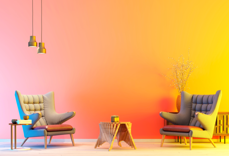
When it comes to transforming your home, nothing has quite the power like a colour. Whether you’re looking for a subtle change or something more drastic, using colour can quickly and easily transform the look and feel of any room. With a little bit of creativity, you can take full advantage of the transformative power of colour to make your interior design dreams come true.
One great way to use colour to transform any room in your home is by painting the walls. This is a relatively inexpensive way to dramatically alter the look and feel of a space without having to replace large pieces of furniture or décor items. Choosing colours carefully will help create an atmosphere conducive to relaxation, work, entertaining friends or whatever activity you enjoy doing in the space.
No doubt using colour in smart yet creative ways can bring new life into any home—whether it’s through painting walls or adding accent pieces. It allows homeowners to express themselves while creating cozy atmospheres that promote relaxation and productivity alike. So don’t be afraid to get creative with how you use colour—you never know what kind of transformation could happen!
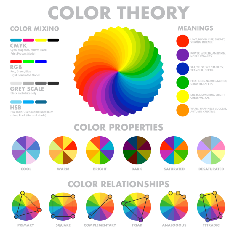
Understanding How Different Colours Affect Energy Levels and Moods
People have long been aware of how painting walls change a room’s energy levels and moods. Colour psychologists believe that different colours can influence emotions, as well as physical responses, depending on their shade, brightness and other aspects.
It is important to note that there is no single right or wrong answer when it comes to using colour for psychological purposes. Each individual will respond differently to various shades and tones of colour, so experimentation is encouraged when attempting to use colour psychology in your own life or environment.
Additionally, it is important to remember that many factors beyond just the hue of a particular colour can influence how people feel and behave; lighting, texture, shape, and movement all play an important role in creating an atmosphere that supports productivity or relaxation.
Ultimately, learning how different colours affect energy levels and moods should be viewed as an individual journey—one which allows us to become more conscious of our responses to things around us so we can better understand ourselves on a deeper level.
Factors to Consider When Choosing Paint Colours
When it comes to selecting paint colours, there are a few key factors that should be taken into consideration. First, the size of the room being painted will determine what colour paint works best. Darker colours will make a small space appear smaller, while lighter hues can open up the area and create an illusion of increased size.
It’s also important to factor in the amount of natural light present in the room—bright sunlight can easily overpower dark shades, so it’s a good idea to opt for softer hues when working with areas where there is plenty of sunlight streaming in.
Additionally, don’t forget to consider the purpose of the room—warm tones are ideal for bedrooms and living rooms, while cooler shades are great for bathrooms and kitchens. Once you have determined which colour scheme works best for your space, you can select from various shades within that hue family.
1. Black
Black stands for knowledge, formality, sophistication and secrecy. When utilized in moderation within an interior design motif, black can add a classic yet stylish flair to the space, especially if done correctly with other colours complementing it. Rooms painted entirely in black may be justifiably striking!
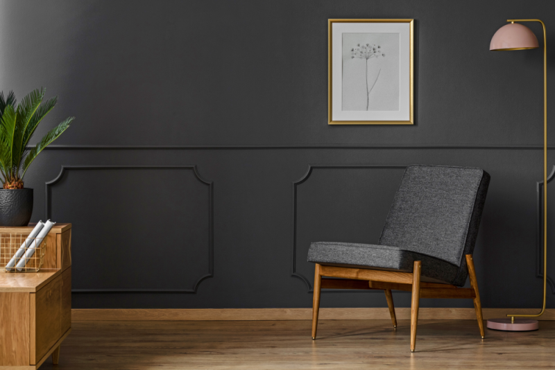
Daring to paint your walls black requires a certain level of confidence. Painting only one wall just doesn’t give you the same effect as creating an entirely inky oasis; that’s how you get drama! But have no fear: if solid black feels too oppressive, consider opting for lighter hues enhanced with accents and objects in shades of ebony like textiles, furniture, or metal pieces. This will bring out both warmth and richness while still incorporating dark tones into your interior décor.
2. Gray
Gray has been historically seen as a symbol of sophistication and elegance. Today, gray can be matched to virtually any decor style; it is the perfect balance between black and white, conveying neutrality while being pleasing to the eye. With its versatility in interior design, skilled professionals are sure to take advantage of this powerful colour palette!
If you’re looking to create a tranquil and concentrated atmosphere, gray is an ideal colour option for any room in the house—whether it be your den, bedroom or office. To create a chic interior design aesthetic, consider blending black and white with touches of either warm or cool colours. By utilizing shades of grey on its own, you can bring out modern edginess as well as classic elegance simultaneously.
3. White
From spirituality to purity, white is an angelic colour utilized in many home interior designs. Incorporating this heavenly hue in your abode can offer a serene and calming ambience; if done correctly, it won’t seem sterile or boring at all! Let the light of faith and goodness into any room with whites for truly divine spaces.
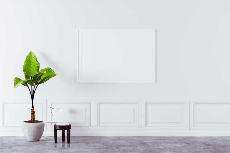
The use of white hues gives the illusion of a more extensive area when used in limited spaces, making them appear larger than they actually are. A room dressed entirely in white has an airy and stunning atmosphere to it! To achieve an even bolder look, pair this flexible neutral option with black for a striking contrast, which will enhance any interiors or decors.
Moreover, since white is often linked with purity, why not apply this versatile colour on your kitchen walls? Complement its brightness by pairing it up with warm, wood accents that come from flooring and cabinetry, thus creating a cozy yet chic style!
4. Blue
As a prominent colour among interior designers, blue is an expression of boundless depth and meaning. It embodies feelings of security, sturdiness, orderliness and dependability: all qualities that make it perfect for personal spaces.
From its light hues to its darker shades—from serene to sombre—blue can evoke a tranquil atmosphere or even a melancholic sentiment in some individuals.
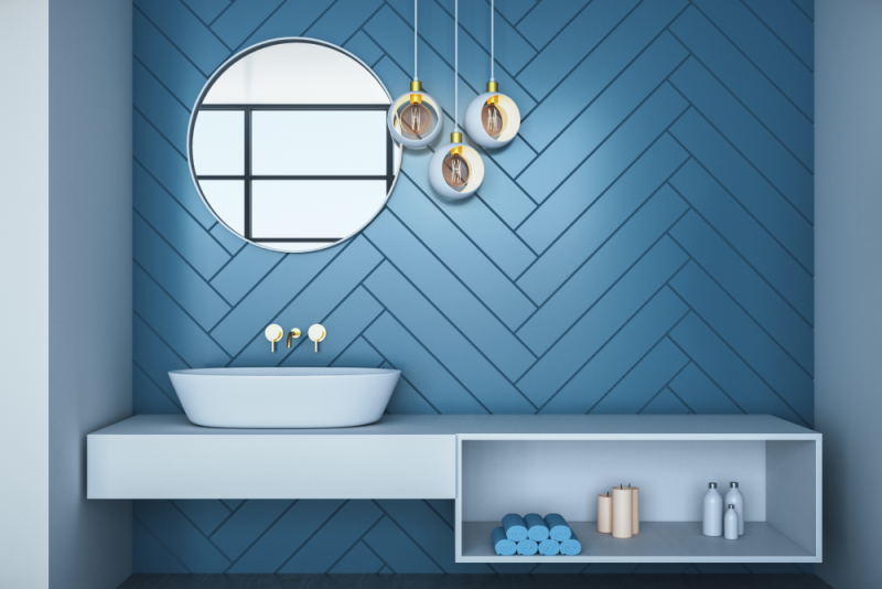
Inviting warm tones of blue with flecks of red will draw in a feeling of intimacy, making the room seem inviting. These hues are perfect for communal areas such as your kitchen, dining or living zone.
Alternatively, cool blues can create an illusion that makes the area appear more spacious; think aqua, turquoise and periwinkle which look exquisite in master bedrooms, home offices or bathrooms.
5. Yellow
The hue of yellow represents the very best in affection, intelligence, wealth and empathy. Rendering a living space in bright shades of yellow creates an environment that is both inviting and cheerful; pastels resemble the commencement of blooming springtime, while golden hues evoke autumn’s comforting warmth.
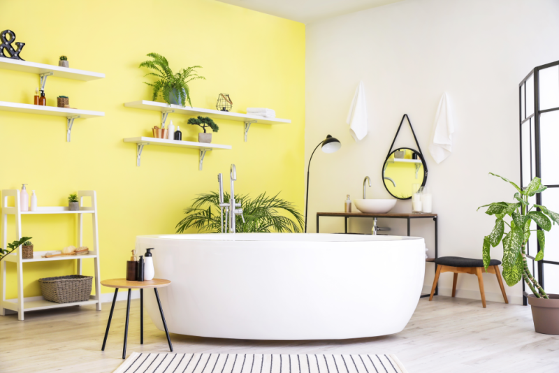
When attempting to create this energizing atmosphere, be mindful not to overdo it as too much can easily become overwhelming! Installing radiant sunlight into a room lined with rich yellows will result in exceptionally classic allure when combined with peachy blue or crimson accents for enhanced depth.
6. Green
Green is a symbol of fortune, abundance, and optimism that radiates natural grandeur. It’s an amiable hue, much like blue, in its versatility for pairing with other colours. White complements green perfectly to create a crisp and clean look, whether it be emerald, mint sagesse, lime zest or even chartreuse vibrancy! This rejuvenating shade will surely inject sophistication into any room at home.
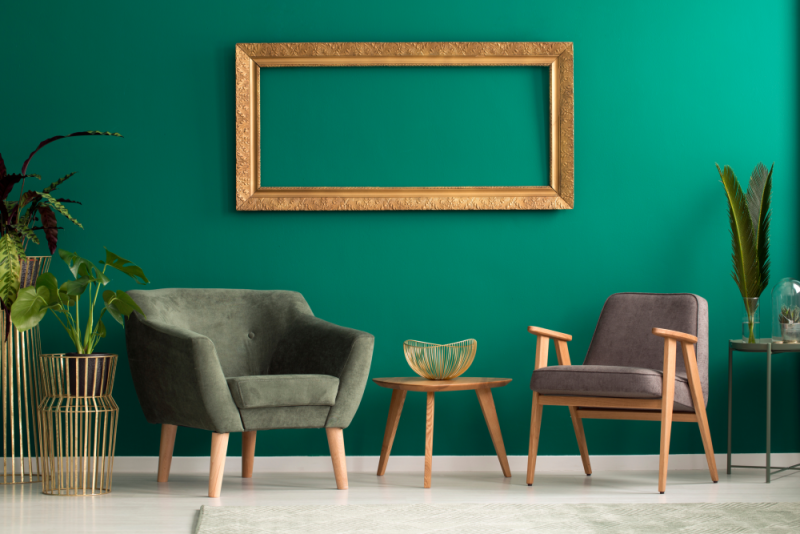
Green is undoubtedly the premier hue for environmental causes, and its distinct shades are invigoratingly stylish. From fern to sage, green’s diverse variations give off a soothing yet fashionable vibe. If you’re looking for complementary colours that go with it well, look no further than neighbouring hues on the colour wheel! For instance, emeralds mixed together with muted greens plus an assortment of blues will generate a serene and calming result.
7. Red
Red is the epitome of intensity, strength, and emotion. Bright shades can be both energizing to the mind and vibrant in space—just not in your bedroom if you’re looking for some quality rest! Subtler tones such as cinnabar or cranberry radiate cozy warmth that invites people into a room. Additionally, certain reds are known to increase hunger, which is why it’s often used by restaurants as well as dining rooms where food is served.
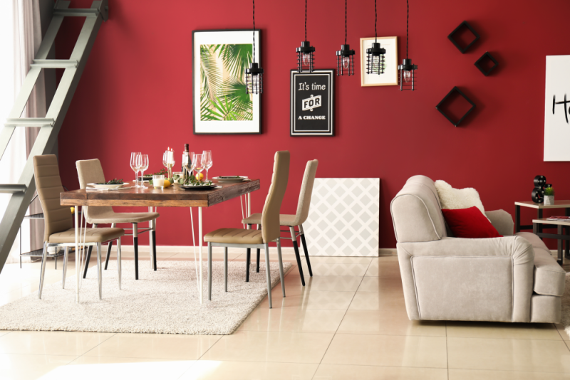
Incorporate reds into your home decor for an eye-catching look! Accents such as pillows, wall art, upholstery and even walls will add a vibrant touch to any room. A few pops of red around the rooms draw attention to other furnishings without being too overwhelming. Even small spaces like foyers or guest bathrooms can be transformed by draping them in shades of beautiful crimson, thus creating an exquisite jewel box environment that you won’t soon forget!
8. Orange
If you’re not a fan of the colour red, why not liven up your home with an eye-catching orange instead? Orange is cheerful and inviting, embodying courageousness and friendliness. Invite incoming family members or guests to feel more alive by adding this vibrant hue to each room in your house.
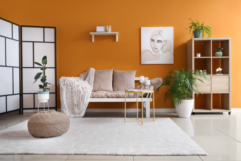
Whether it is terra-cotta or tangerine, orange will give any space that extra jolt of enthusiasm it’s looking for! To really complete the look, pair this energizing shade with either crisp white or calming grey for a modernized effect.
Orange provides an exciting pop like vitamin C does, so don’t let dullness take over; instead, add some brightness to your interior today!
9. Brown
If you’re searching for a warm, inviting hue to bring the space together, look no further than brown! Brown is created by combining red, yellow and blue, making it complementary with any and all colours. Whether you decide on light beige or deep chocolate-brown tones, this colour will make any room feel cozy in an instant. There’s nothing quite like sitting down at your dining table surrounded by warm shades of brown or retreating to the bedroom after a long day, feeling embraced by its comforting hues.
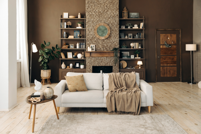
Brown has long been associated with organic and natural settings, making it an ideal hue to give your interiors a rustic vibe when combined with green. The deeper, muted shades of brown promote stability and sophistication while lighter hues instill contentment and security. In either case, this rich colour will imbue your space with comforting vibes.
10. Beige
Beige is a perfect background or accent colour since it takes on the characteristics of other colours in a space. When beige stands alone, though, it can appear monotonous and uninspiring. Nonetheless, with its versatility and chameleon-like qualities in any room design scheme, beige remains an excellent choice, depending upon how you use it!
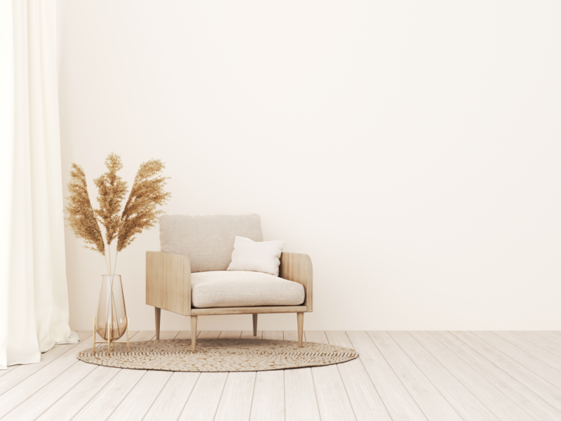
Beige is a timeless and versatile hue that blends beautifully with colours like red, gray, brown and black. It’s often referred to as tan, fawn, cream, taupe or ivory. Not only does beige promote soothing vibes in any space due to its calming effect but it also gives you the freedom of playing around with accessories within cool or warm tones whenever you feel creative! With this uncomplicated shade at your disposal, transforming the energy of your neutral room has never been easier.
11. Purple
With its luxurious and noble air, purple is an incomparable choice of colour to use in home decor. Not only does it evoke a sense of abundance and leadership but also promotes a tranquil atmosphere perfect for spiritual or mental pursuits. From regal violets to subtle lavenders, purple’s range offers something special at any saturation level.
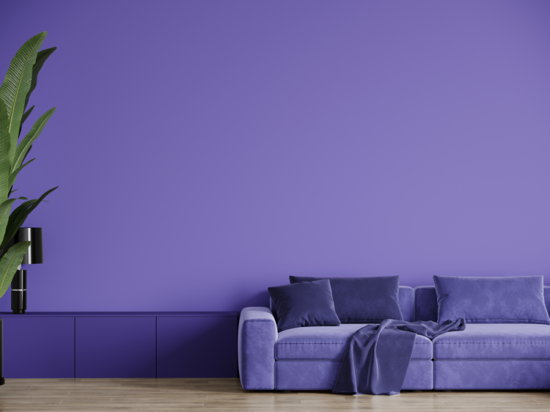
Make a daring statement with purple! Whether you opt to deck the room out in this luxurious hue or use it in dainty accents, there is no doubt that your decor will be unforgettable. To create an elegant atmosphere, pair shades of purple with other jewel tones and lighter colours like soft yellow, pastel pink or white. The possibilities are endless!
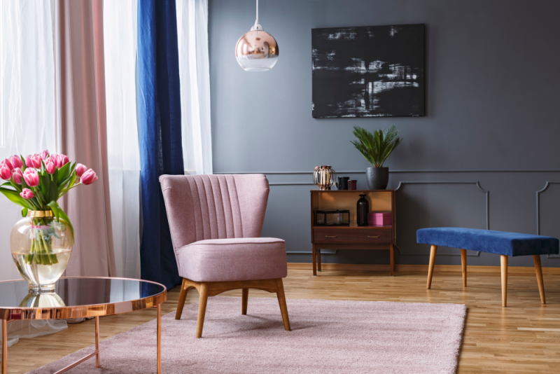
12. Pink
Pink is a soft shade of red, typically associated with emotions such as love and romance. It often sparks memories of childhood days filled with sugary treats and innocence. Pink has also become embedded in the feminine identity, demonstrating gentleness, a caregiving nature and empathy. When used lightly in pastel tones, it can be calming to look at; however, when its intensity increases, it might evoke feelings of restlessness instead.
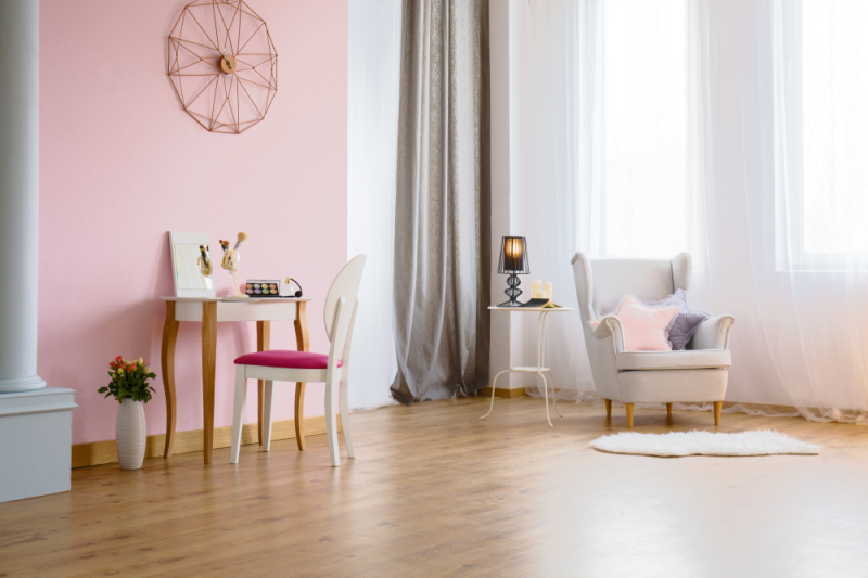
A dreamy shade of pink plays nicely with daring shades such as deep teal and rusty orange. Too much of a good thing can be counterproductive; therefore, if you’re using an abundance of this colour in your space, it’s best to balance out the vibrancy with neutrals. Introducing modern furnishings will turn any bubblegum-inspired room into one that oozes glamour!
Embracing the power of colour to enhance your home’s look and feel
If you’re looking for an easy and effective way to improve your home’s look and feel, consider embracing the power of colour through a fresh coat of paint. By understanding how different colours affect energy levels and moods, you can choose paint colours that create a positive atmosphere in your home.
As a bonus, painting is also an inexpensive home improvement solution that can be completed relatively quickly. When it comes time to select paint colours for your home, don’t hesitate to call Renaissance Painting and Carpentry for assistance. We would be more than happy to provide you with a quote and help transform your space into the realization of your vision.