Paint is an excellent way to change the ambience of your house rapidly, but we know it can take time to choose paint colours. Find inspiration by following these tips to choose interior paint colours that will turn out beautifully, and de-stress your home in the process.

Are you the person who is looking for inspiration in this painting sample?
The top mistake people make when choosing a paint
Choosing the colours at the store: Don’t panic and rush to buy a few shades of paint. You can ask for samples so that you can choose the best option from the paint strips you take home.
Going to the store, you will find thousands of colours available with their own unique characters and variations. With so many colours to choose from, it can be tough to find the one you want just by looking at them in the container.
Choose paint strips and consider undertones and light
The colour you choose for your home improvement project can seem different than the sample due to differences in lighting. Paint is composed of different hues that work together to create undertones, and these undertones can look completely different based on lighting conditions.
It’s important to remember that light affects how we perceive colour; warm lights make cool tones appear warmer and vice versa. Different times of day will also result in disparate appearances—colours always seem lighter or darker, depending on the time of the day.

For all these reasons (and more), choosing your final palette before heading to pick up supplies is crucial if you want accurate results for how to create the right colour flow throughout your home.
Use the colour wheel to find perfect combinations.
The first step to choosing the perfect paint colour is understanding the colour wheel. The colour wheel is a tool that helps designers and painters understand how colours work together.
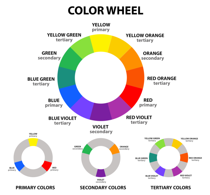
The following combinations are based on geometric relationships and can be represented by shapes. By rotating these shapes around the central point of a colour wheel, you’ll have an unlimited number of combos!
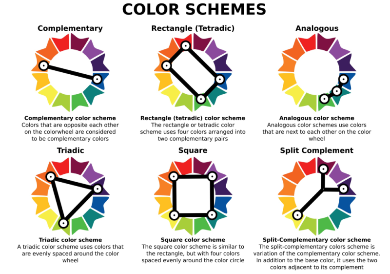
Colours placed next to each other on the wheel are considered “complementary colours.” When complementary colours are placed next to each other, they create the most visual contrast.
When choosing interior paint colours, it’s best to select two or three complementary colours to create an inviting and visually interesting space. However, be careful not to use too many bright colours at once, as this can make a space appear chaotic.

If you’re having trouble choosing a complementary colour scheme, consider using a monochromatic colour scheme that uses different shades and tints of a one-colour family. This can be a great way to add interest to a room without using too many bright colours.

Once you’ve selected your complementary colours, it’s time to start picking paint!
Understanding Paint Swatches
To better understand how to choose the right paint colour for your home, understanding how to read paint swatches will help you immensely. Most paint swatch samples come in one of three forms:
Solid colour
Two-colour strip
Three-colour triangle
The most important thing to remember is that the colours on the paint swatch will look different in your room than they do on the swatch. As mentioned previously, the difference may be due to the light in your room affecting the way the paint colour looks.
So, it is important to remember to take into account the natural light in your room when choosing a paint colour.
Another thing to keep in mind is that paint colours can appear different depending on the brand you choose. So, it’s always a good idea to check different brands before making a final decision.
What to do before committing to paint colours

There’s no reason to ignore this most basic rule: always check the paint colours. When you commit thousands of paints and hours to a project, you must be able to achieve that colour the first time. This should not be avoided. In front of some paint shops, you can possibly find stacked cans of paint returned by people who hadn’t taken the time to test it. Do not become one.
You need to confirm how the colour looks in different lights and with different materials; you also want to make sure the colour looks good with your furniture and decor. If you have any doubts, ask a professional for help. They can help you choose the perfect paint colour for your home.
You want to see how the colour looks in different lights and with different materials. You also want to make sure the colour looks good with your furniture and decor. If you have any doubts, ask a professional for help. They can help you choose the perfect paint colour for your home.
The quick and easy way to discover your skin’s undertone by using a sheet of paper
You can use your undertone to select the best paint colour for your house. If you’re not aware of what they are, don’t worry, it’s an easy test. Get a sheet of white paper and hold it in front of your face under natural light. If the skin appears more yellow or peach, then you have warm undertones. On the other hand, if the skin looks bluish or purpleish, you have cool undertones. This trick can help everyone find also the perfect combination of clothes and makeup.
Picking paint colours and finding inspiration around the corner
Looking for interior paint colour inspiration can be easy if you know where to look. Sometimes the best ideas come from everyday objects or experiences. When choosing interior paint colours, using your existing home furnishings as a reference is a good trick to take. This will help you to see how the colours might look in your space and if they will clash with your current decor. It’s also a great way to get ideas for new furniture or accessory purchases.

Paint selection: Start with a mood board
If you’re having trouble choosing a colour, it can also be helpful to create a mood board. A mood board is simply a collection of images that represent the feeling you want your room to evoke.

Here are a few suggestions to get you started:
TV Shows:
If you’re watching a show with an interesting colour scheme, take note of the colours used and see if they might work in your own home.
Memories:
A dream colour palette that you remember from your childhood or teenage years can inspire great interior paint colours. Think about the ambience you loved in your younger days and see if any of them would work in your current space.
Places You’ve Visited:
A nice weekend getaway can provide some great ideas for interior paint colours. Take pictures of the places you visit and see if any of the colours would work in your own home. This can be anything from pictures of your favourite vacation spot to images of nature.
Current furniture:
A great way to select colours for your home is by using the colours in your existing furniture as a reference.
Magazines:
Many people consider magazines essential for coming up with ideas for their decor, especially when it comes to colours. You can find trends in colour by leafing through any type of magazine, whether it’s full of glamour shots or just gossip.
Social Media:
Pinterest and Instagram provide colour inspiration which is updated in real-time. Pinterest helps to create ideas on your favourite topic and keeps it easy to find ideas. On the other hand, Instagram can offer various influencers the latest trends and eye-catching combinations.
Pull Your Paint Colour from a Print:
One easy way to find interior paint colours is by looking at the colours in your existing clothes, linens, and cushions. This will give you an idea of the colours that you like and might want to use in your home. You can also take this approach when choosing colours for your next furniture purchase.
Find Your Paint Colour in Artwork:
Utilizing an artist’s colour scheme in your home can help to create a sense of cohesion and harmony. By choosing a similar colour palette, you can bring the same feeling of peace and creativity into your own space.
Market leaders in the Paint Industry are a Safe Bet:
The Top Paint and Coatings companies have gathered an array of colours for your convenience so that you can find the perfect hue for your project. With these options, you’re sure to find something that fits your taste.
Think About your Lifestyle
You should pick hues for your home based on your family dynamic and how much time you’re willing to spend cleaning up messes. If you have kids or pets, you’ll want to choose colours that are easy to clean. It’s essential to think about your lifestyle. Life with little ones or furry friends often means saying goodbye to light-coloured walls and delicate fabrics.

For a dining room, choose a neutral colour that will look good at different times of the day. If you have a room that gets a lot of sun, you might want to choose a light colour that will reflect the light. And if you have a room that you want to feel cozy and intimate, choose a dark colour. Whatever your needs, there’s a paint colour out there that will work for you.

Decide what mood you want to create in each room — do you want it to be relaxing or energizing?
The rule of thumb is that lighter colours make a room feel more open and airy, while darker shades give a room a cozy feeling. But there’s more to it than that. You also need to consider the entire space’s flow and choose a paint colour that will complement the furniture and fixtures or smaller proportions, such as on a door or an accent wall.
In the living room, for example, you might want a calming colour like blue or green. You may want something more energetic in the dining room, like yellow or red. And in the bathroom, you might want something refreshing, like mint green or sky blue.

Different lighting can also play a role in creating different moods. For example, natural light makes a room feel more cheerful, while artificial light can make a room feel more intimate. Choose a colour that will help you achieve that goal.
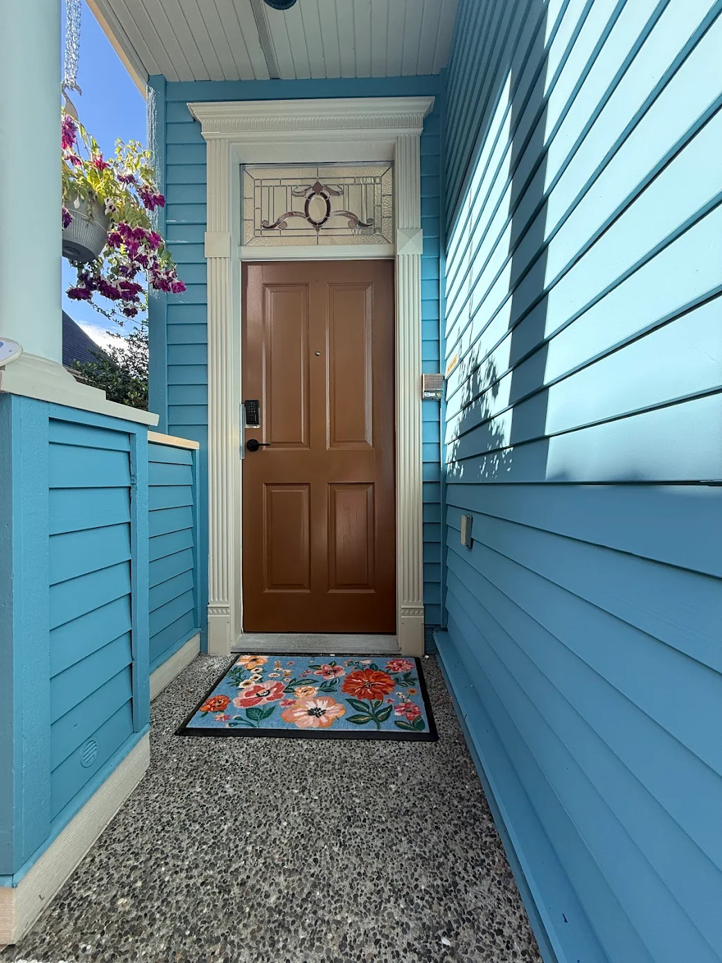
Smooth crown mouldings and baseboard combination
One great way to add a pop of colour to your home is by using contrasting crown mouldings and baseboards. You may be surprised by how well the colours transition!
This will help to brighten up a space and add some personality. However, it’s important to use this effect sparingly in order to avoid colour clashes. Try limiting it to one or two rooms, like the living room and dining room, or use it in a study for a more professional look.
Although painting all trim, moulding, and baseboards the same colour creates consistency, it is not always necessary. For example, black baseboards can provide a stark contrast that anchors a room while black crown moulding will frame the ceiling and draw your attention upwards. Additionally, door casings and doors do not have to match in colour.

Ask for help from a professional if you’re having trouble choosing the right colour
If you’re undecided about what paint colour to choose, it might be time to ask for help from a professional. Painters have spent years refining their techniques in choosing colours that work well together in any type of space. They can guide you to find the ideal shade for your home and provide useful tips on how to mix and match colours.
At Renaissance Painting and Carpentry, we have years of experience helping homeowners select the perfect paint colours for their homes. We’ll work with you to understand your vision and help you choose a colour that will bring it to life. We’ll also provide expert advice on applying the paint to achieve the desired results. Contact us today to schedule a consultation with one of our experienced painter contractors.